Image Optimization
Examples
According to Web Almanac, images account for a huge portion of the typical website’s page weight and can have a sizable impact on your website's LCP performance.
The Next.js Image component extends the HTML <img> element with features for automatic image optimization:
- Size Optimization: Automatically serve correctly sized images for each device, using modern image formats like WebP and AVIF.
- Visual Stability: Prevent layout shift automatically when images are loading.
- Faster Page Loads: Images are only loaded when they enter the viewport using native browser lazy loading, with optional blur-up placeholders.
- Asset Flexibility: On-demand image resizing, even for images stored on remote servers
🎥 Watch: Learn more about how to use
next/image→ YouTube (9 minutes).
Usage
import Image from 'next/image'You can then define the src for your image (either local or remote).
Local Images
To use a local image, import your .jpg, .png, or .webp image files.
Next.js will automatically determine the intrisic width and height of your image based on the imported file. These values are used to determine the image ratio and prevent Cumulative Layout Shift while your image is loading.
import Image from 'next/image'
import profilePic from '../public/me.png'

export default function Page() {
  return (
    <Image
      src={profilePic}
      alt="Picture of the author"
      // width={500} automatically provided
      // height={500} automatically provided
      // blurDataURL="data:..." automatically provided
      // placeholder="blur" // Optional blur-up while loading
    />
  )
}
Warning: Dynamic
await import()orrequire()are not supported. Theimportmust be static so it can be analyzed at build time.
Remote Images
To use a remote image, the src property should be a URL string.
Since Next.js does not have access to remote files during the build process, you'll need to provide the width, height and optional blurDataURL props manually.
The width and height attributes are used to infer the correct aspect ratio of image and avoid layout shift from the image loading in. The width and height do not determine the rendered size of the image file. Learn more about Image Sizing.
import Image from 'next/image'

export default function Page() {
  return (
    <Image
      src="https://s3.amazonaws.com/my-bucket/profile.png"
      alt="Picture of the author"
      width={500}
      height={500}
    />
  )
}
To safely allow optimizing images, define a list of supported URL patterns in next.config.js. Be as specific as possible to prevent malicious usage. For example, the following configuration will only allow images from a specific AWS S3 bucket:
module.exports = {
  images: {
    remotePatterns: [
      {
        protocol: 'https',
        hostname: 's3.amazonaws.com',
        port: '',
        pathname: '/my-bucket/**',
      },
    ],
  },
}
Learn more about remotePatterns configuration. If you want to use relative URLs for the image src, use a loader.
Domains
Sometimes you may want to optimize a remote image, but still use the built-in Next.js Image Optimization API. To do this, leave the loader at its default setting and enter an absolute URL for the Image src prop.
To protect your application from malicious users, you must define a list of remote hostnames you intend to use with the next/image component.
Learn more about
remotePatternsconfiguration.
Loaders
Note that in the example earlier, a partial URL ("/me.png") is provided for a local image. This is possible because of the loader architecture.
A loader is a function that generates the URLs for your image. It modifies the provided src, and generates multiple URLs to request the image at different sizes. These multiple URLs are used in the automatic srcset generation, so that visitors to your site will be served an image that is the right size for their viewport.
The default loader for Next.js applications uses the built-in Image Optimization API, which optimizes images from anywhere on the web, and then serves them directly from the Next.js web server. If you would like to serve your images directly from a CDN or image server, you can write your own loader function with a few lines of JavaScript.
You can define a loader per-image with the loader prop, or at the application level with the loaderFile configuration.
Priority
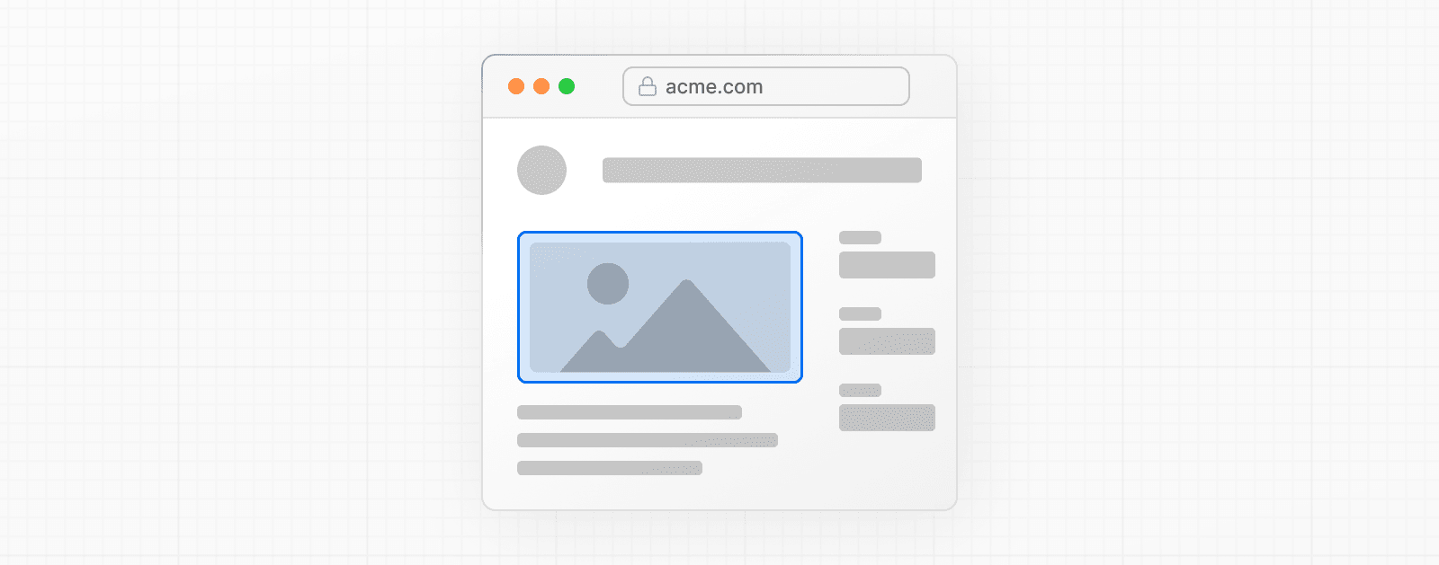
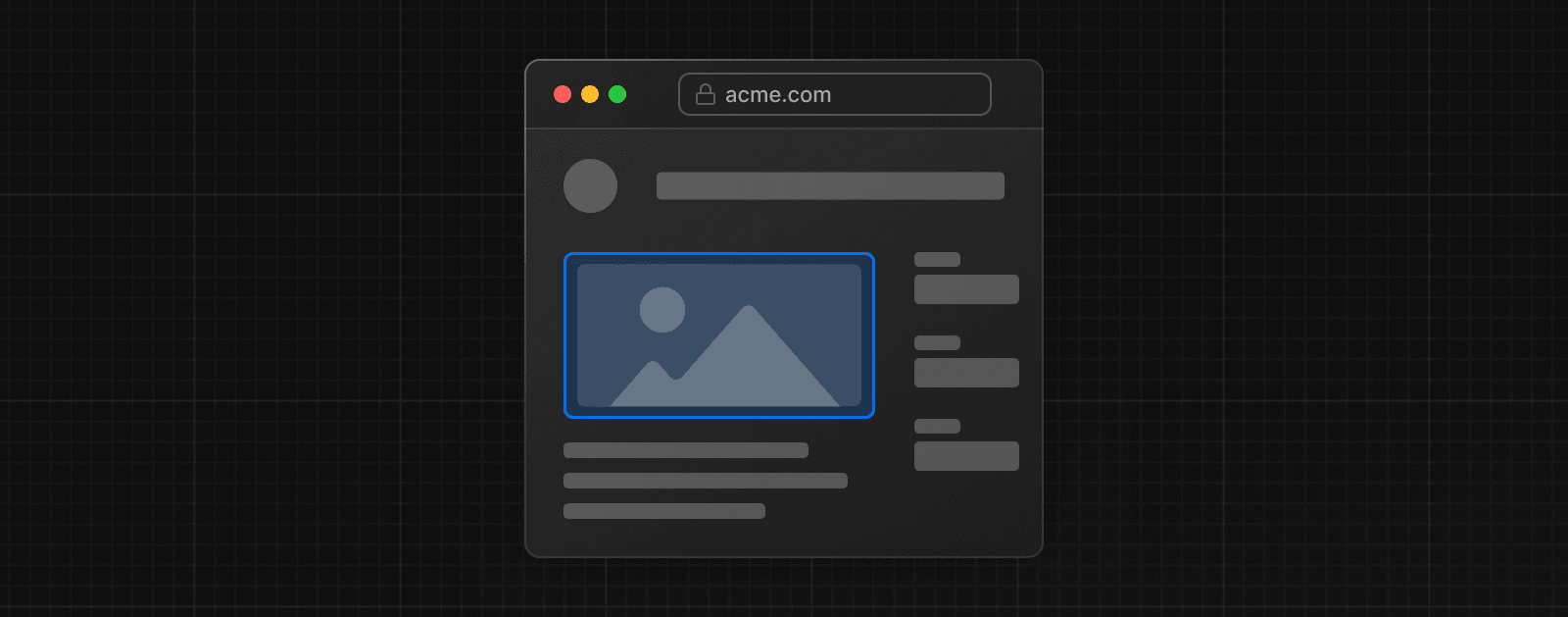
You should add the priority property to the image that will be the Largest Contentful Paint (LCP) element for each page. Doing so allows Next.js to specially prioritize the image for loading (e.g. through preload tags or priority hints), leading to a meaningful boost in LCP.
The LCP element is typically the largest image or text block visible within the viewport of the page. When you run next dev, you'll see a console warning if the LCP element is an <Image> without the priority property.
Once you've identified the LCP image, you can add the property like this:
import Image from 'next/image'

export default function Home() {
  return (
    <>
      <h1>My Homepage</h1>
      <Image
        src="/me.png"
        alt="Picture of the author"
        width={500}
        height={500}
        priority
      />
      <p>Welcome to my homepage!</p>
    </>
  )
}
See more about priority in the next/image component documentation.
Image Sizing
One of the ways that images most commonly hurt performance is through layout shift, where the image pushes other elements around on the page as it loads in. This performance problem is so annoying to users that it has its own Core Web Vital, called Cumulative Layout Shift. The way to avoid image-based layout shifts is to always size your images. This allows the browser to reserve precisely enough space for the image before it loads.
Because next/image is designed to guarantee good performance results, it cannot be used in a way that will contribute to layout shift, and must be sized in one of three ways:
- Automatically, using a static import
- Manually, by including a
widthandheightproperty used to determine the image's aspect ratio. - Implicitly, by using fill which causes the image to expand to fill its parent element.
What if I don't know the size of my images?
If you are accessing images from a source without knowledge of the images' sizes, there are several things you can do:
Use
fillThe
fillprop allows your image to be sized by its parent element. Consider using CSS to give the image's parent element space on the page alongsizesprop to match any media query break points. You can also useobject-fitwithfill,contain, orcover, andobject-positionto define how the image should occupy that space.Normalize your images
If you're serving images from a source that you control, consider modifying your image pipeline to normalize the images to a specific size.
Modify your API calls
If your application is retrieving image URLs using an API call (such as to a CMS), you may be able to modify the API call to return the image dimensions along with the URL.
If none of the suggested methods works for sizing your images, the next/image component is designed to work well on a page alongside standard <img> elements.
Styling
Styling the Image component is similar to styling a normal <img> element, but there are a few guidelines to keep in mind:
- Use
classNameorstyle, notstyled-jsx.- In most cases, we recommend using the
classNameprop. This can be an imported CSS Module, a global stylesheet, etc. - You can also use the
styleprop to assign inline styles. - You cannot use styled-jsx because it's scoped to the current component (unless you mark the style as
global).
- In most cases, we recommend using the
- When using
fill, the parent element must haveposition: relative- This is necessary for the proper rendering of the image element in that layout mode.
- When using
fill, the parent element must havedisplay: block- This is the default for
<div>elements but should be specified otherwise.
- This is the default for
Examples
Responsive


import Image from 'next/image'
import mountains from '../public/mountains.jpg'

export default function Responsive() {
  return (
    <div style={{ display: 'flex', flexDirection: 'column' }}>
      <Image
        alt="Mountains"
        // Importing an image will
        // automatically set the width and height
        src={mountains}
        sizes="100vw"
        // Make the image display full width
        style={{
          width: '100%',
          height: 'auto',
        }}
      />
    </div>
  )
}
Fill Container


import Image from 'next/image'
import mountains from '../public/mountains.jpg'

export default function Fill() {
  return (
    <div
      style={{
        display: 'grid',
        gridGap: '8px',
        gridTemplateColumns: 'repeat(auto-fit, minmax(400px, auto))',
      }}
    >
      <div style={{ position: 'relative', height: '400px' }}>
        <Image
          alt="Mountains"
          src={mountains}
          fill
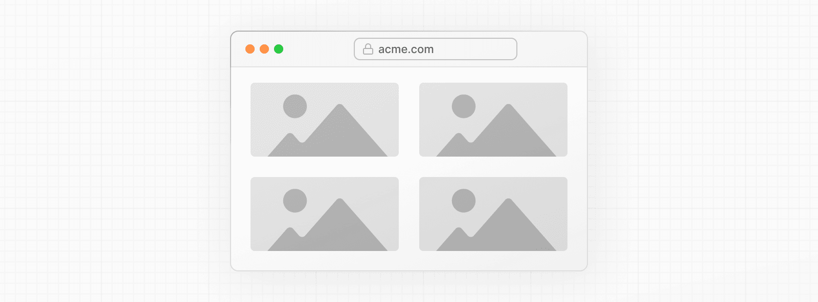
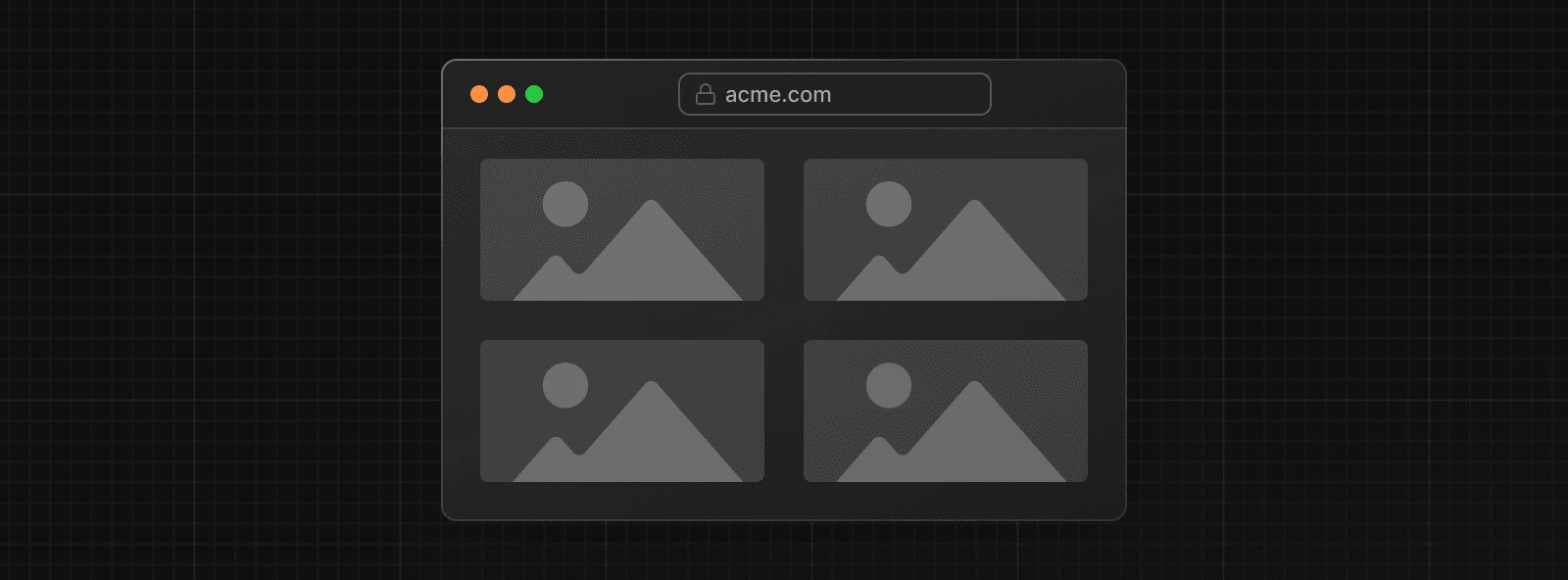
          sizes="(min-width: 808px) 50vw, 100vw"
          style={{
            objectFit: 'cover', // cover, contain, none
          }}
        />
      </div>
      {/* And more images in the grid... */}
    </div>
  )
}
Background Image


import Image from 'next/image'
import mountains from '../public/mountains.jpg'

export default function Background() {
  return (
    <Image
      alt="Mountains"
      src={mountains}
      placeholder="blur"
      quality={100}
      fill
      sizes="100vw"
      style={{
        objectFit: 'cover',
      }}
    />
  )
}
For examples of the Image component used with the various styles, see the Image Component Demo.
Other Properties
View all properties available to the next/image component.
Configuration
The next/image component and Next.js Image Optimization API can be configured in the next.config.js file. These configurations allow you to enable remote images, define custom image breakpoints, change caching behavior and more.
Read the full image configuration documentation for more information.
Was this helpful?